What’s a professional sports league without jersey sales? Without fashion statements? The Pro Volleyball Federation’s seven first-year teams have rolled out home unis and road uniforms, and even alternate uniforms and special event uniforms, in some cases.
It’s not too early to pick our favorite uniforms in PVF. We list one per team this time. Maybe we’ll come back later and add alternates, but for now, we’ll start by giving each team a critique.
7. Vegas Thrill
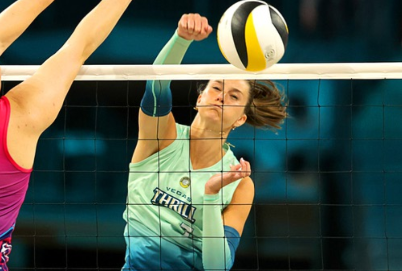
For a city known for excitement and entertainment, the Vegas entry in the PVF has missed the mark. Their primary logo is the weakest in the league. It’s basically a wordmark. We’re also unimpressed with the color scheme of light green and blue hues.
Our favorite Thrill uni is the one shown above, with a lime green fading into sunset blue. It sort of feels like the Seattle Seahawks a little. But, as you’ll see it doesn’t match up with the best duds we see at the net.
6. Omaha Supernovas
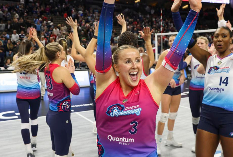
What is it with the fade scheme? Like the Thrill and a few other PCF teams, the Supernovas are big on blending and fading colors down and across their uniforms. We’re fans of the name SUPERNOVA, but the team missed out by choosing to go with watermelon and light blue colors, instead of a bright yellow and black (you know, as in a Supernova?).
Arm and elbow sleeves can add a lot to a volleyball uniform, and we like Omaha’s use of a star field on those. Positive marks for that.
5. Columbus Fury
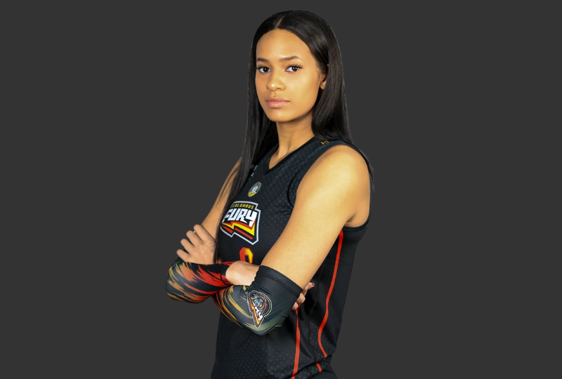
Ironically, the Fury uniform looks more like what a Supernova uni should be.
The Fury are named after a Medusa-style mythical character, and we LOVE their primary logo. But the lightning bolt and flame sleeves make this look a little too much like the MATCHBOX toy car logo. Still, you can never go that wrong with a black uniform.
4. Grand Rapids Rise
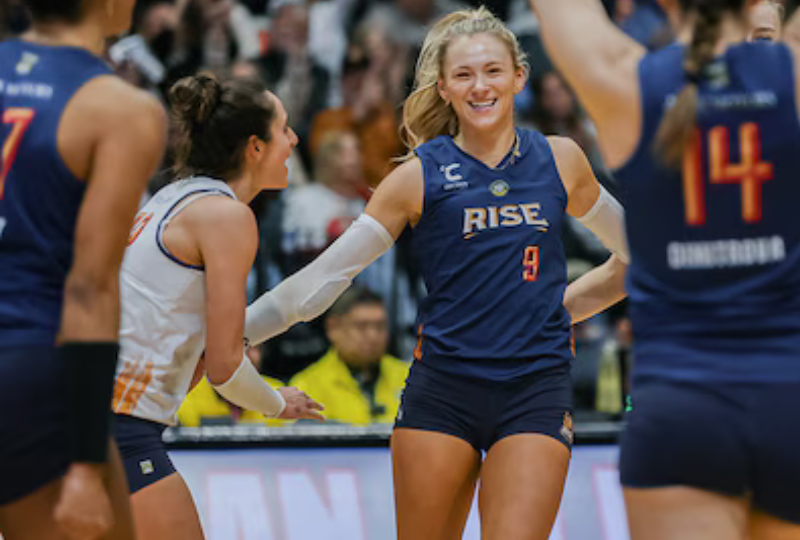
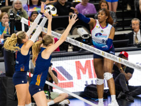
The Grand Rapids Rise did a fine job with their team name, team logo, and color scheme. But we wish they had a uniform design that lived up to those lofty standards. The team has three options: white jersey with blue shorts, blue jersey with blue shorts, or red jersey with blue shorts. We prefer the BLUE BLUES, like that being worn by star Clair Chaussee above.
We love the classy, simple arm sleeves, and the subtle touch of a flame on the bottom sides of both the jersey and shorts (as in a Phoenix rising from the ashes).
3. Atlanta Vibe
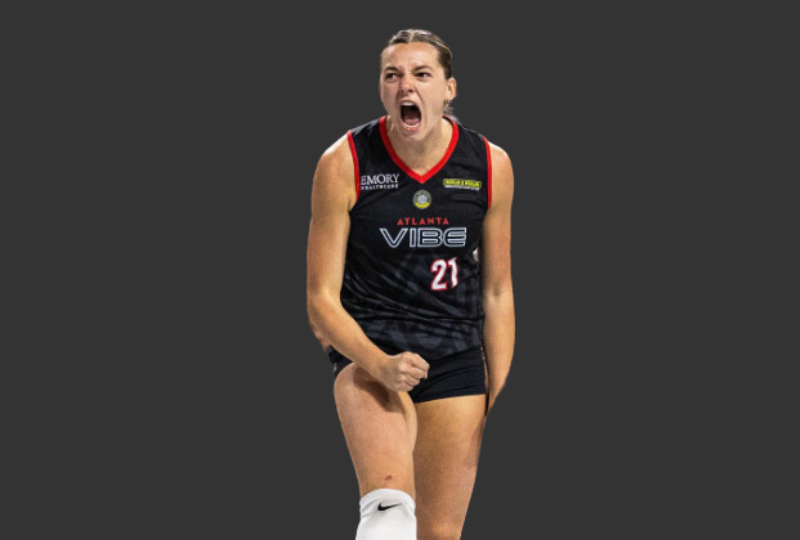
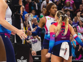
Black on black jerseys are sick, and the alternate for the Atlanta Vibe is no exception. This team has arguably the coolest wordmark logo in the Pro Volleyball Federation. We like that the team colors basically match another Atlanta team (the Falcons).
Marlie Monserez, shown above, is one of the brightest and most appealing stars in the PVF. She plays with passion and always seems to be having fun. We love the “V” designs that haunt the bottom of the jersey.
2. Orlando Valkyries
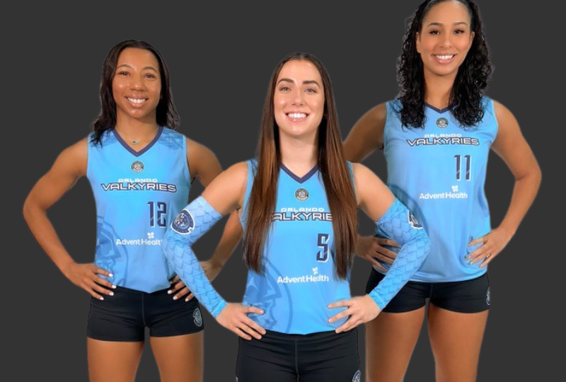
Why more professional sports teams don’t utilize baby or light blue, is beyond us. The Valkyrie have a great logo, and they also had the wisdom to put together these great uniforms that match light blue and black. Fantastic.
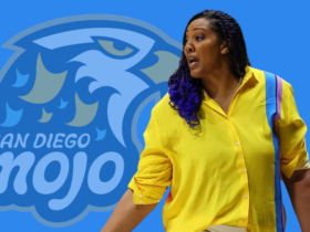
1. San Diego Mojo
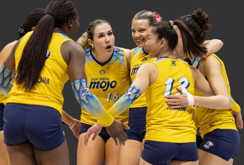
One of the words that comes to mind when people think of San Diego is “funky.” As in funky like “groovy” and “out of sight.” San Diego has a reputation as a laid back, chill city. And it is.
The choice of “Mojo” was an excellent decision. But even smarter than that is the use of yellow and light navy blue, in an homage to the city and sunsets in San Diego, as well as the U.S. Navy, and even the heritage of the San Diego Padres (maybe?).
We love the yellow POP of these jerseys, and the funky design on the shoulders sets it apart from any other team in the league.


Leave a Reply